UI/UX design trends for 2022

Arkadiusz Janeczko

Joanna Wróbel

Jakub Dobek

Alexa Trachim
UI/UX design is a field that’s particularly interesting for many reasons – and it extends far beyond software development. It’s a crucial layer of every digital product. Aesthetic is a big part of it, of course, but seamless interactions with the user are also important. They say clients only notice the UX and UI components when there’s something wrong.
Table of contents
- UX and UI post-pandemic – analytics, understanding personas, becoming truly online
- New technologies to support UI/UX
- Aesthetics of 2021 – what will stay in UI
- What else is there?
- Summary
To deliver modern solutions, we have to keep up with trends and innovations in all areas of our work. So we’ve asked our UI/UX design experts to share their thoughts and insights regarding the upcoming 12 months. They discuss UX/UI novelties and talk about existing phenomenons that will expand in 2021. Let’s see what they have to say.

UX and UI post-pandemic – analytics, understanding personas, becoming truly online
Arek, Senior UX Designer at itCraft, noticed that because of the coronavirus pandemic, businesses previously operating only offline have to develop an online presence – and they have to do it quickly. People’s habits have changed when it comes to choosing and using products and services, and competition is fierce.
To manage in such a challenging environment, companies should invest in analytics, audits and user research first. The goal is clear – to better understand target personas and design flawless customer journeys. Making data-driven decisions is essential for creating optimized sales funnels and converting digital product users into actual clients.
As for the software itself, Arek said it should be as simple and usable as possible. This means that the relevance of UX design is growing. Product owners shouldn’t ignore the importance of consultations – they should throw around new ideas and discuss and polish them with their chosen providers to achieve results that are aligned with their strategies.
Read also:
Your quick guide to Product Discovery workshops and consultations
Product Owners’ guide to Agile Scrum. Part1 – The growing difficulty of change
Product Owners’ guide to Agile Scrum. Part1 – Single point of contact
Privacy is also becoming a big trend. More and more companies are implementing robust solutions to protect their users’ data. Designers have to keep that in mind when creating visuals – functionalities should also include security measures.

New technologies to support UI/UX
Our UI/UX Designer, Joanna, is enthusiastic about voice-based solutions. Virtual assistants like Siri and Alexa are becoming mainstream. Designers will have to create products with such capabilities in mind. Voice navigation, searches and personalized alerts will be standard in digital products for 2021 and beyond. We often don’t have time or the ability to focus on the screen, so we appreciate the convenience of immediately using hardware without touching it.
Using voice features gives the eyes a break and reduces screen time. Currently, we all have potential speaking devices in our pockets – smartphones with tons of mobile apps that can utilize voice UI to make our lives easier. Both big enterprises and small startups are developing their own voice solutions, not to mention speakers, assistants, wearables, and smart home equipment. This is a challenge for UX and UI designers to tackle ASAP.
It’s worth mentioning that this advanced level of voice technology is possible thanks to artificial intelligence – which will also be a strong trend in UX, UI and software development in general. Augmented/virtual reality, machine learning and similar technologies are growing stronger, so design has got to follow.

Aesthetics of 2021 – what will stay in UI
According to Jakub, another Senior UI/UX Designer at itCraft, many visuals, such as 3D assets, are still going to be widely used. Since it’s becoming easier to create 3D elements with dedicated tools – UI specialists won’t have to seek external help when making them. There are libraries full of freebies like high-quality images, animations and icons that can be used to support the design process.
Jakub also brought up blurry backgrounds as an up-and-coming trend. Using gradients and light colours makes the user interface warm, welcoming and easy on the eye. Contrasts are not what people are looking for – transitions between colours should be barely noticeable, and preferred palettes include rich shades.

Designers and their clients aren’t afraid to use juicy or even intense, dark tones on their websites and in mobile apps. Even though we are looking for minimalism in UX and UI, colours often stand out. Geometry and bold fonts are also likely to stick with us in 2021. These aesthetics are not entirely new – but they’ve started to gain momentum in recent years and are still popular today. The community agrees that you haven’t seen the last of them. When it comes to design, trends hang around longer than just one season.
What else is there?
2021 will embrace bold shapes and forms – because people are looking for something unique, adventurous and atypical. We want products that are not only highly functional and user-friendly but also original. Only brands that approach UX and UI design with courage will stand out and, in the end, be loved by their users.
Let’s take a closer look at some more UI/UX trends for the upcoming months.
Eye-catching visuals
When designers work on an app or a webpage, they have to remember multiple aspects of a software product. Usability functions, easy navigation, and all the essential features have to be implemented without a doubt, but how do we make them pop? By using impressive visuals.
In web design, floating elements are usually applied. They are complemented with delicate shadows to give the user a feeling of “movement”. It’s a subtle way to make the website more dynamic.
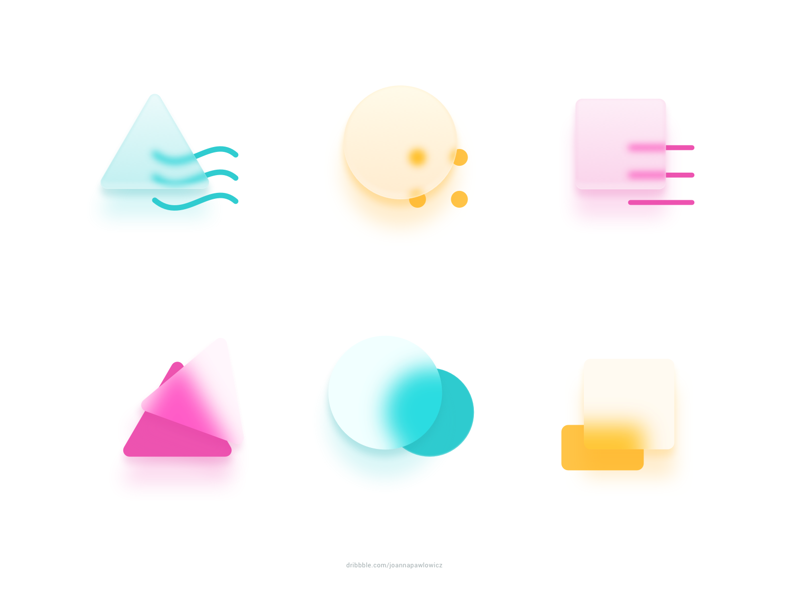
We also have glassmorphism, a design style where the main element is a bit transparent and the background is blurred – giving the user a “looking through the glass” vibe. It was introduced a couple of years ago, but in 2021, it will become even more popular with fresh colours and more outstanding details.
Brutalism / 90s retro style
Not to be confused with brutalism in architecture, brutalism in design is that strange thing that’s been happening over the last few years – causing websites and apps to become… ugly? It depends on one’s taste, of course, but there is no doubt that there’s something weird about strong contrasts, bold lines and often hard-to-read fonts. And it’s trending! See the example of such a website.

We could attempt to distinguish between brutalism, 90s style and something called antidesign, but they have a lot in common. First of all, they deconstruct our current views on beauty and “good” design. We miss the times when websites were mainly informative and looks were secondary. It’s a fascinating approach, but it has to be done mindfully – otherwise, it will tire users and quickly turn them away.
Focus on people
This trend comes in many forms. In terms of visual UX and UI design, we will use more human-centred graphics in 2021. We don’t want to see the generic vector illustrations that were popular like 3 years ago. Real-life pictures, realistic drawings of people, anthropomorphic animations – they all make software look and interact with us more like another human being. Think of it as a prelude to more self-aware computers that will be able to imitate our reactions and emotions while serving us with their purpose.

Another thing is personalization – UI and UX designers have to create tailored solutions that will match the individual user’s preferences. Recommendations, suitable content, software that understands our habits – it’s a trend that won’t change, probably ever. Customers don’t want generic apps and websites. They want information that they relate to.
Dark mode all the way
More and more apps and pages have a built-in dark mode option or match the system settings on our phones. People feel that staring at bright white screens for too long exhausts them. And they’re painful to use at night. There’s another advantage, too – screen brightness can (and will) significantly influence battery life. A light screen will drain your battery much more than a dark one. Ergo: using dark mode keeps your phone alive longer.

This mode not only provides benefits for users but also for product owners. Dark backgrounds mean new possibilities regarding colour accents. UI designers can easily distinguish essential features, and the whole look is more sophisticated. The only disadvantage is when there’s a lot of text on the screen. When that’s the case, stick to a lighter theme.
The power of copy
Brands with a unique tone always get more attention. But remember – without text, your digital product won’t be fully functional. That’s because we can’t replace alerts and messages with icons or illustrations. In many cases, it just wouldn’t be understandable.

That’s where UX writing comes in. It’s an area of copywriting that works with UX design to create natural, friendly texts to be implemented within the product. Even issue alerts should sound like they’re spoken by the brand. Using emojis, specific language and catch-phrases all enhance the relationship between the user and the brand. It’s more realistic and more fun. This kind of copy leads to an unforgettable user experience.
Simple = the best
Some industry specialists claim that the UX/UI design process has just become too complicated. It’s harmful to both product owners and designers because the design stage lasts longer than it should. This can hurt the product and in turn, the clients. Procedures, names and terms should be simplified so all involved parties have an understanding of what’s going on and can contribute with their ideas and insights.
This way, UX itself becomes more straightforward and more convenient. The user’s journey shouldn’t require too many steps to achieve what the product promises. One example is the registration process. Back in the day, we had to manually fill in each field. Now we can do it via a social media profile with one click. In 2021, it’s going even further – logging in won’t even require a password.
Summary
As you can see, UI/UX design trends for 2021 are specific yet versatile. Strictly regarding visual aspects, there are many options, and we’ve provided a couple of hints for teams working directly with clients and product owners. Results are important, but we also focus on the process and its efficiency.
Our designers at itCraft are always up to date with the latest trends in their industry. If you want to work with an IT partner that can create functional software with a stunning look – we’re the right choice for you. Contact us and we’ll get started working on your boldest ideas together.
